Stop Losing Sales: How to improve your website conversion rate (without more ad spend)
18 December 2025
1
min read


Written by
Justin Sommerville
Conversion rate optimisation helps eCommerce brands increase sales by improving UX, trust, and checkout flow—without spending more on advertising.
If your website is bringing in traffic but not enough sales, you’re not alone. Most businesses obsess over getting more visitors, when the real opportunity lies in getting more out of the visitors they already have. For an eCommerce brand turning over $500k a month, increasing your conversion rate from 3% to 5% could mean an additional $120,000 in monthly sales, the kind of growth usually reserved for massive ad campaigns. The best part? You can achieve that without spending a single extra dollar on ads. So, how do you unlock that potential? It starts by refining the way your website works, not just how it looks. Here are five actionable ways to make your website convert more customers.
What is CRO?
Conversion rate optimisation (CRO) is the process of increasing the number of website visitors who complete a specific action. It’s about fine-tuning your website, backed by data, to make it easier for customers to convert. Whatever action you want people to take on your site becomes the focus, and CRO helps you optimise it through small, strategic changes that create a big impact.
CRO is a highly structured process informed by analytics, data, and your overall business goals to encourage visitors to take action. And with paid advertising becoming increasingly competitive and expensive, partnering with a conversion rate optimisation agency (like TAG) allows you to get more from what you already have, the customers already visiting your website.

Funnel Analysis
1. Homepage: Clarity Converts
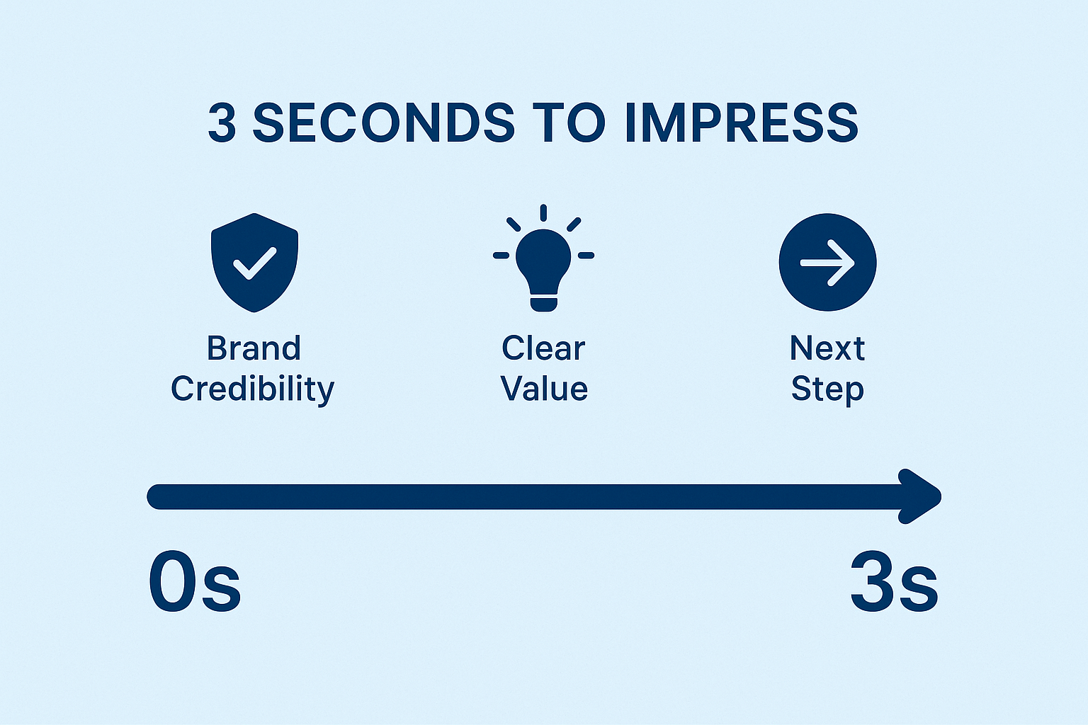
You have just 3 seconds to make a first impression before users decide whether to stay or bounce. In that time, your website needs to clearly communicate what you offer, who it’s for, and why it matters. That doesn’t always mean shouting your value proposition in words. A strong visual identity with clean layout, high-quality photography, consistent typography, and purposeful colour use can communicate just as much as your copy.
Example: A premium clothing brand might not need to say “luxury” – they show it through minimal design, refined colour palettes, and aspirational imagery that evokes quality and craftsmanship.
Pair this with intuitive navigation and one clear path forward (“Shop Now,” “Explore,” or “Book a Demo”). Every scroll, click, and section should reinforce why someone should trust your brand and take action.
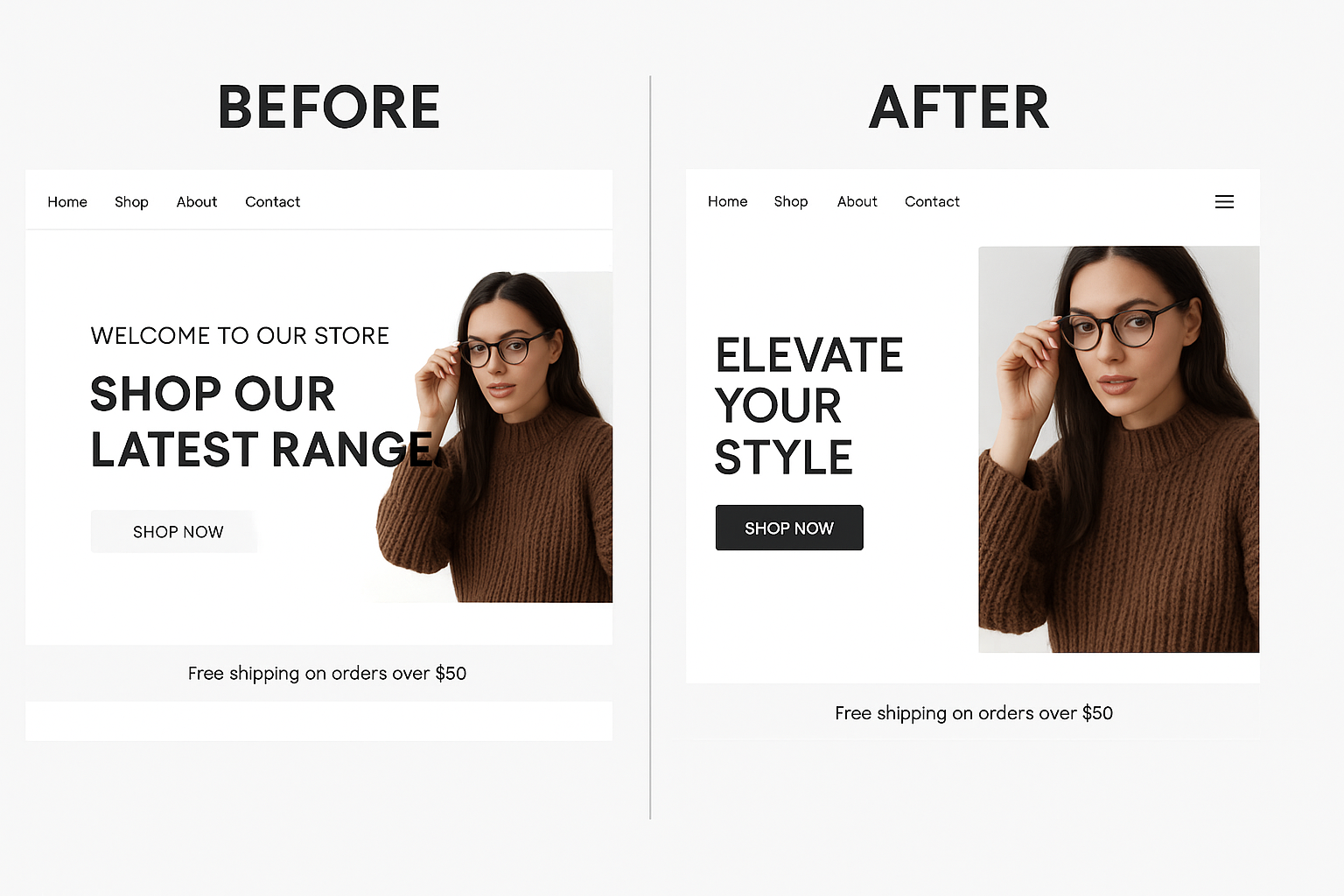
Pro tip: Ensure your key content and CTA appear above the fold on both desktop and mobile. This maximises visibility and engagement within those crucial first few seconds.
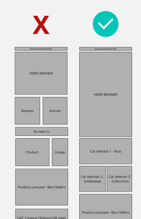
2. Collection Pages: Guide, Don’t Confuse
Your collection or category pages should feel like a well-organised store – everything easy to find, no clutter, and a natural flow that guides users toward what they want. Group products in a way that mirrors how your customers actually shop, not how your internal systems are structured. Simple filters like size, colour, or purpose often outperform complex, brand-specific taxonomies.
Stat to remember: Sites with intuitive navigation and product hierarchy can see conversion rates jump by up to 30% compared to those that bury items in endless menus.
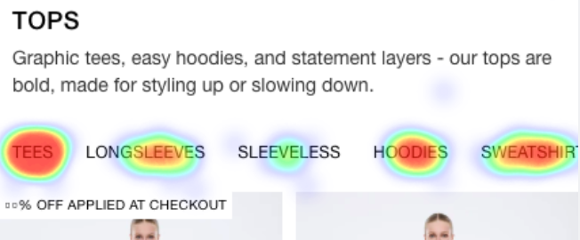

Pro tip: Use data from tools like Hotjar or Google Analytics to identify friction points. For example, if users frequently click the back button or drop off at filters, you’ve found a UX issue worth testing.
3. Product Pages: Build Trust and Desire
This is where decisions happen. A great product page needs to do three things: educate, reassure, and persuade. Start with visuals – multiple high-quality angles, close-ups, and lifestyle imagery help users imagine ownership. Then, focus your copy on benefits, not features.
Example: Instead of “Made from 100% cotton,” say “Soft, breathable cotton that lasts through hundreds of washes.”
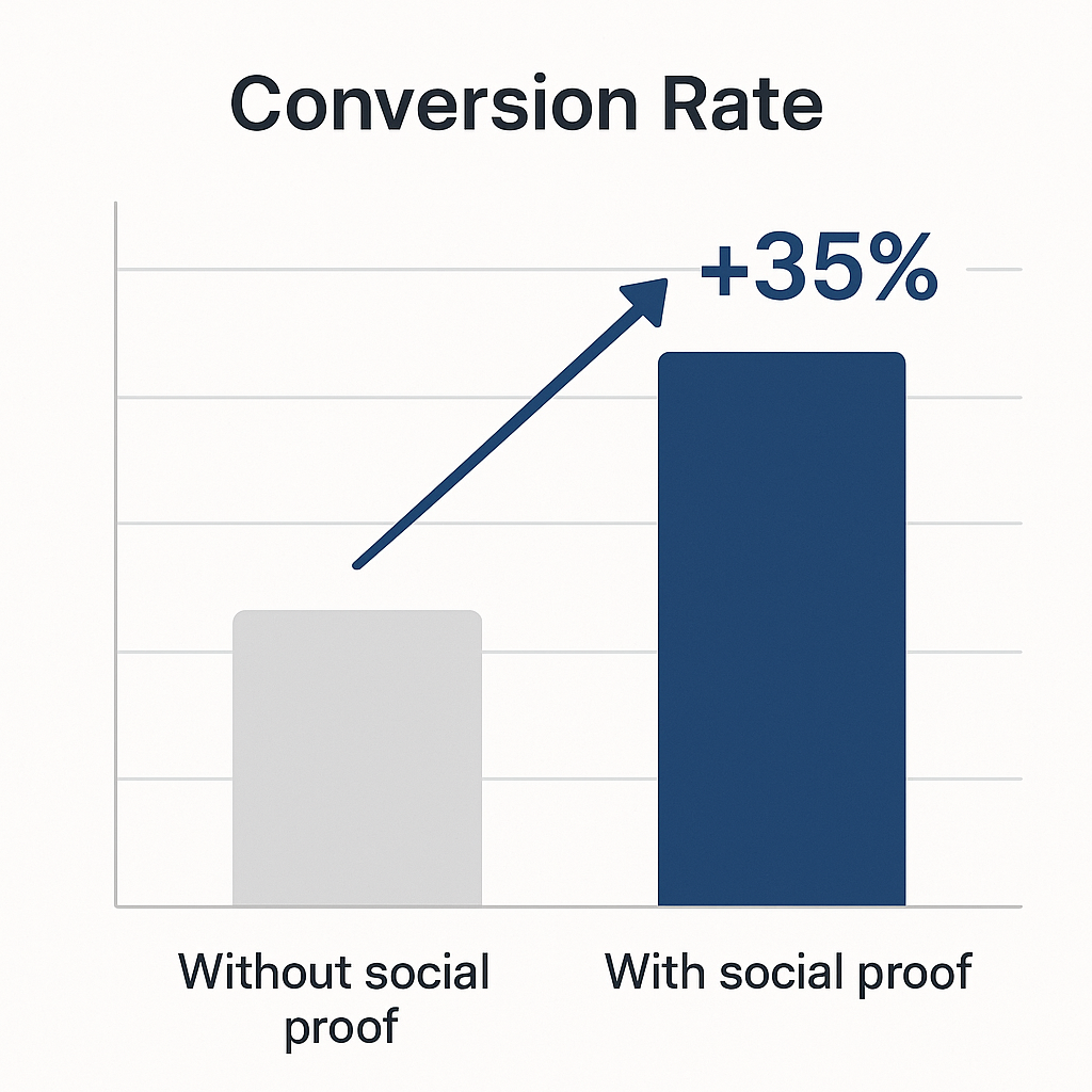
Back it up with social proof. Ratings, reviews, and UGC are non-negotiable. Adding authentic customer reviews alone can increase conversions by up to 35%.
Pro tip: Include dynamic, data-informed elements like “Only 3 left” or “10 people are viewing this now.” These subtle cues use behavioural psychology to increase urgency and trust.
4. Cart: Keep the Momentum Going
Once someone’s in the cart, the goal is to keep them moving, not second-guessing. The fewer decisions they need to make, the better. Keep your layout clean, show a simple summary, and make checkout the next logical (and visible) step. Remove distractions like unrelated links or unnecessary pop-ups.
That said, smart personalisation can increase value without friction. Offer logical add-ons (“Complete the look,” “You might also like”) instead of random product pushes. Done well, this can increase average order value by 10–15%.
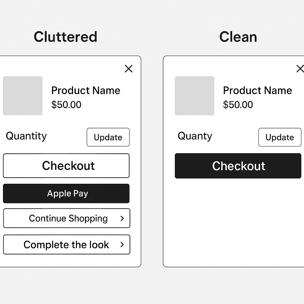
Pro tip: While express checkout options such as Shop Pay, Apple Pay, or Afterpay are great for reducing friction, adding too many of them in the cart can create visual clutter and confuse users about which path to take. Consider introducing them during checkout instead for an improved experience.
5. Checkout: Streamline the Finish Line
The average cart abandonment rate sits around 70%, and lengthy or confusing checkouts are a major cause. Simplify forms – only ask for what you truly need. Use progress indicators so customers know how close they are to completion. Offer guest checkout and save details for returning users.
If your products are high-value or custom, consider adding a “Speak to an Expert” or live chat feature. It gives hesitant buyers a chance to ask questions before dropping off.
Pro tip: Test the checkout on mobile first. Over 70% of online purchases now happen on mobile devices, so even minor mobile friction can have a massive impact.
Bonus: Quick Wins You Can Test This Week
- Add a free shipping progress bar (“You’re $15 away from free delivery”).
- Showcase real-time stock levels to create urgency.
- Move trust badges or guarantees higher on key pages.
- Add a persistent “sticky add-to-cart” button on product pages for mobile users.
- Use data and session recordings to identify drop-off points and test improvements.
Final Thoughts
Improving your website’s performance isn’t always about small tweaks. Sometimes, it takes bold, structural change. Just ask Booking.com, which has reinvented its interface countless times through continuous experimentation and data-driven design decisions. The point is simple: don’t guess. Let data guide every design choice, content update, and layout shift.
At TAG, we help brands uncover where their websites are leaking conversions and fix it using data, insights, and design experimentation. From heatmap analysis to prototype testing, we blend creativity with science to help brands grow smarter.
For more tips or advice, contact an expert here, and get a response same day.

.jpg)
.jpg)


.jpg)